Everybody in History, Everywhere, all at Once
January 5, 2024
H  Sometimes we can only get a distorted image of the past, not unlike this rather imperfect study that the author did of a painting by John Singer Sargent.ow many people alive in the year 0 CE are still known today? For a definition, let us say that in order for a person to be "known" by the written record, we need to be able to find their name, as well as some rudimentary information like the year they died. Go ahead, try to estimate it; if you are right by order of magnitude, that would already be quite impressive! In the following, we will try to approximate the answer to this question and many related ones with open data.
Heavy-Handed Exposition
Here is an excerpt from a nice book by the stoic philosopher Seneca, where he advises us not to get too caught up in our daily work, and relates an anecdote about a random Roman guy to illustrate the point:
Shameful is he whose breath leaves him in the midst of a trial when, advanced in years and still courting the applause of an ignorant circle, he is pleading for some litigant who is the veriest stranger; disgraceful is he who, exhausted more quickly by his mode of living than by his labour, collapses in the very midst of his duties [...]. Sextus Turannius was an old man of long tested diligence, who, after his ninetieth year, having received release from the duties of his office by Gaius Caesar's own act, ordered himself to be laid out on his bed and to be mourned by the assembled household as if he were dead. The whole house bemoaned the leisure of its old master, and did not end its sorrow until his accustomed work was restored to him. [...V]ery many have the same feeling; their desire for their labour lasts longer than their ability.
Let us now completely ignore his actual argument here to instead find out more about this Sextus fellow. And low and behold, he has an article on more than seven editions of Wikipedia; apparently he served as a prefect of Egypt for a total of three years. In the digital age, it will surprise few that this kind of information is just available, but now we will decide to take this state of affairs seriously to its fullest extent and try to compile everybody who is accessible to us in this way. We can then run wonderful statistics and discover many surprising facts about the corpus. More ancient times are naturally more relevant as a subject of study here, because with the adoption of birth registers we can of course look up more or less everyone with the appropriate permissions and a government inquiry. An interesting modification of the original premise will thus necessarily bleed into our investigation, namely to look into the set of individuals who we not only know but also care about. Any answer that we give will always lie between the two bounds, especially considering all of the documenting material that exists physically, but is unavailable to us because nobody took the initiative to publicise it due to lack of means to do so or of editorial interest.
Precedent
Remaining on this point for a minute, we might be tempted to forget about history and instead ask ourselves how many people we deem somehow important to record among those who live today. How many people are famous? Luckily there is a perfect article answering the very same by Arbesman (2013). Here, we also get a hint on how to investigate our business: He simply counted the number of people in the living people category on Wikipedia and divided through the world population. For all the faults that brings with it, we find this is a nice idea for an approximation. The result was a fraction of 0.000086 Repeating this in 2023, we get 0.00013; Wikipedia has grown. , or 0.00041 if only the English-speaking population is used as a divisor. We want to follow this method, but we additionally need some information about the lifespan of the individuals to get to an estimate for any particular time. First, we want to find the time distribution of the biographical information collected on Wikidata. The encyclopedia is accessible via a SPARQL endpoint. We pose queries of the following form to it: For readability, property IDs have been substituted with their human-intelligible equivalent and query optimisation was omitted.
          SELECT (COUNT(*) AS ?count)
          WHERE {
          ?item is HUMAN;
                  has property DATE_OF_BIRTH;
                  has property DATE_OF_DEATH;

          FILTER EXISTS {WIKIPEDIA_ARTICLE about ?item}
          FILTER (year < Year(DATE_OF_BIRTH) < year + 1)
          }
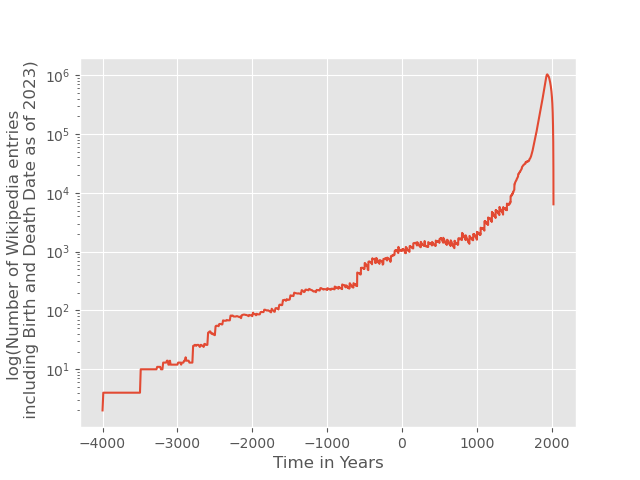
and thereby obtain the count of people listed on Wikidata having a recorded time of birth, time of death, who were born between year and year + 1 and who have a Wikipedia article in any language. We do the analogous query to find out how many people died between year and year + 1. Existence of birth and death dates ensures a reasonable lower bound on notoriety of the people included in our analysis, but also - more importantly - renders it possible to compute their lifespan. Our queries begin with the year 4000 BCE. Since growth is exponential, let us have a looks at a time span where the numbers start to be visible on a linear scale.
It is somewhat strange that big events like the Black Plague do not really show up in these numbers. However, the two terrible World Wars possibly in combination with the Spanish/American flu are visible, as in the closeup below. One of the many reminders not to repeat this ever.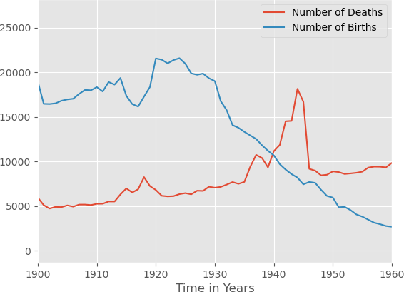
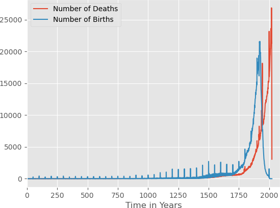
As perhaps expected, this is something like exponential growth. Strangely though, there are periodic peaks of yearly births and deaths at full centuries, indicating that the dates of some people were only known to the editor within one century — as is for example the case for pharaoh Ramses I.
We can also visualise this. Here is a graph of the fraction of individuals listed as born in the first year of the century (top), or decade (bottom, round half centuries as scatter plot).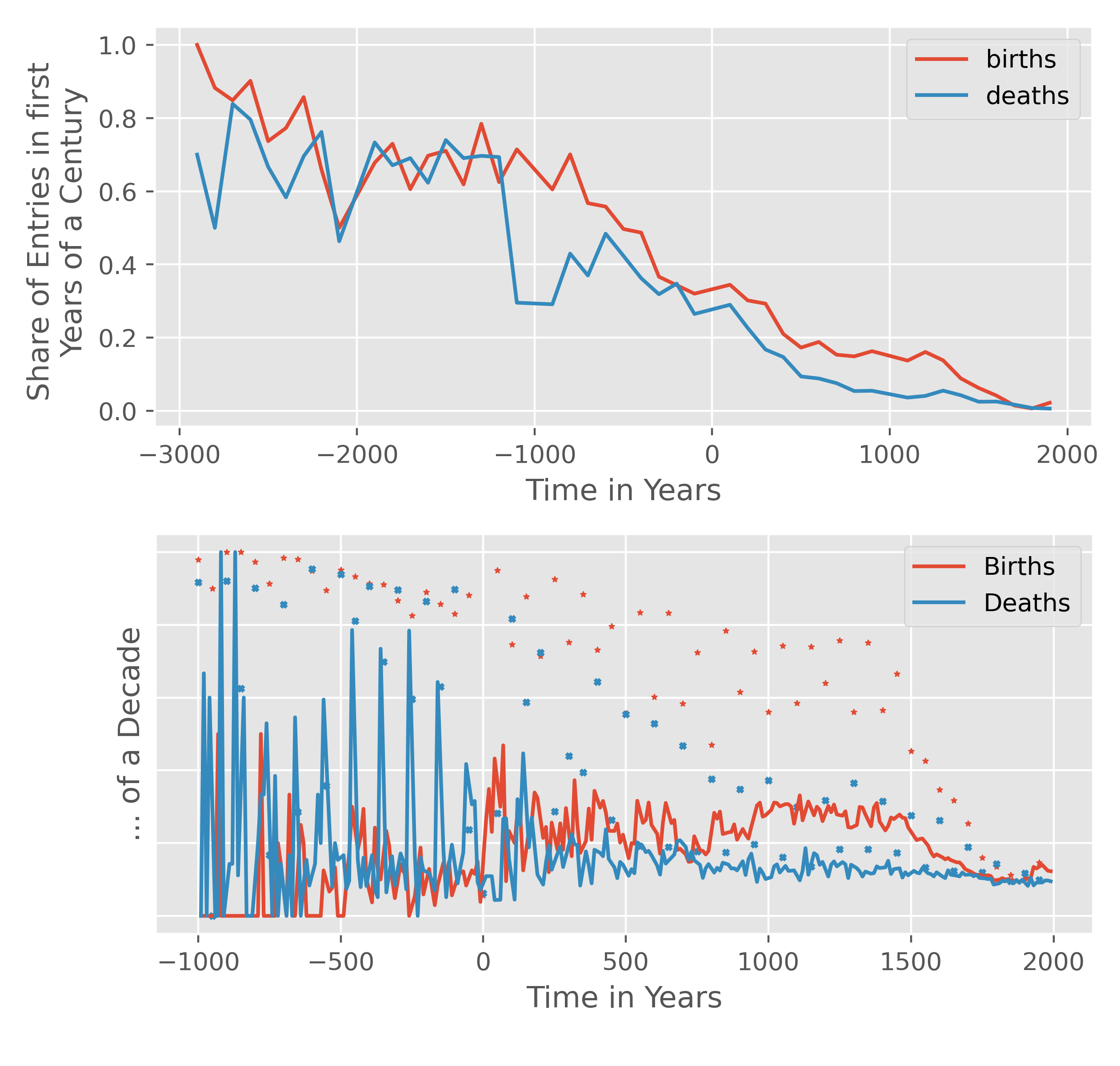 Note the strangely linear decay from everyone's birth date only being known up to the century to the expected fraction of 0.01 and 0.1 for completely accurate birth years.
Such spikes also occur at half-centuries and decades to a lesser extent.
Another small kink catches our attention, namely that both curves fall again approaching the present. This is only natural as we are only looking at people who are already registered as dead. Let us keep in mind not to take the data from 1930 onwards at face value.
We now subtract the deaths from the births for each year and sum over the result, giving us the "population of Wikipedia" as it varies over time. We use semi-log plots from now on.
Note the strangely linear decay from everyone's birth date only being known up to the century to the expected fraction of 0.01 and 0.1 for completely accurate birth years.
Such spikes also occur at half-centuries and decades to a lesser extent.
Another small kink catches our attention, namely that both curves fall again approaching the present. This is only natural as we are only looking at people who are already registered as dead. Let us keep in mind not to take the data from 1930 onwards at face value.
We now subtract the deaths from the births for each year and sum over the result, giving us the "population of Wikipedia" as it varies over time. We use semi-log plots from now on.
And we have found one possible answer to the question from the beginning already. Pretty much exactly 1000 people around the year 0 BC are known, at least in Wikipedia.
But we can go further and find another really interesting quantity: Dividing by the world population
The world population from before 1940 CE is referenced from the History Database of the Global Environment (HYDE)[4] and from the United Nations Department of Economic and Social Affairs [11] for years 1941 until 2022. Here is a graph: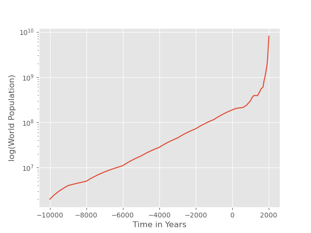 Note that it rises by two and a half orders of magnitude from 4000 BE to today.
, we get the fraction of the world population with a Wikipedia article in any language. We additionally apply a smoothing filter to even out the fluctuations due to date inaccuracies.
Note that it rises by two and a half orders of magnitude from 4000 BE to today.
, we get the fraction of the world population with a Wikipedia article in any language. We additionally apply a smoothing filter to even out the fluctuations due to date inaccuracies.
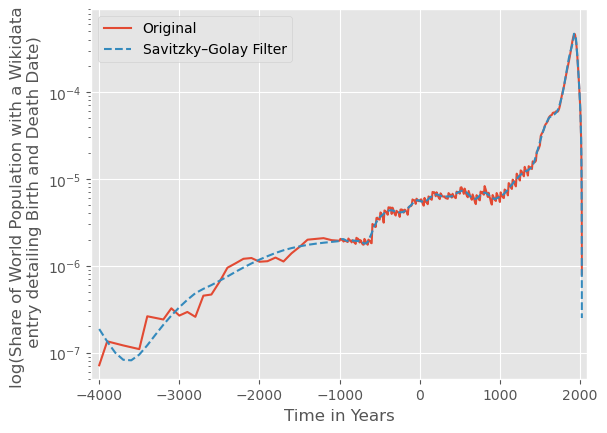
The last two graphs are endlessly interesting, are they not? We concentrate on the second. It is not exponential (which would show as straight on a semi-log plot), nor simply logistic, nor even monotonously increasing. Perhaps it is best described as multiple logistic curves stitched together at important points in time? For example, the uptick at around 600 BCE (Ancient Athens and Rome?) seems rather suspicious. The one starting from 1740 around the beginning of the Enlightenment is the last one and particularly impressive. Maybe you have your own convictions where the other surges come from or even disagree with the reasons given here, but what seems somewhat decisive is the noticeable disappearance of the inaccurate dates after the invention of the printing press in 1440. We can also compare with Arbesman and find that the maximum is in 1930 at 0.00047, which is between the two estimates he gave. Perhaps one expects it to be less since we only consider dead people, but Wikipedia has also grown by quite a bit in the last decade. In any case, a great chart.
Moving on, we can do the same with weekdays and months. Weekdays seem not to show interesting results, but the birth months are a curious case.
Here is a Nightingale diagram: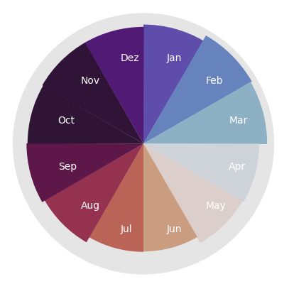 They show the opposite of what would be expected given today's birth statistics and the fact that most of the people in Wikipedia come from the Northern hemisphere.
Help from the Professionals
But enough with the basic webscraping for now, let us bring in a more powerful tool. A Brief History of Human Time (BHoHT) by Laouenan, Bhargava, Wasmer et al. (2022) M. Laouenan et al. A cross-verified database of notable people, 3500BC-2018AD. Scientific Data, 2022. is a dataset that does sort of what we did on our own, but cross-checks Wikidata and Wikipedia with Natural Language Processing, thereby also exposing some more data. For instance, the birth place. As an introduction to the dataset, let us plot the birthplace of everybody in it on a map, starting from the most recently born folks and working our way back to ancient times. We then color everybody by the time of birth as given by the logarithmic scale on the bottom. The ancient people are printed on top, because otherwise they would be completely drowned out by the sheer mass of more recently born individuals.
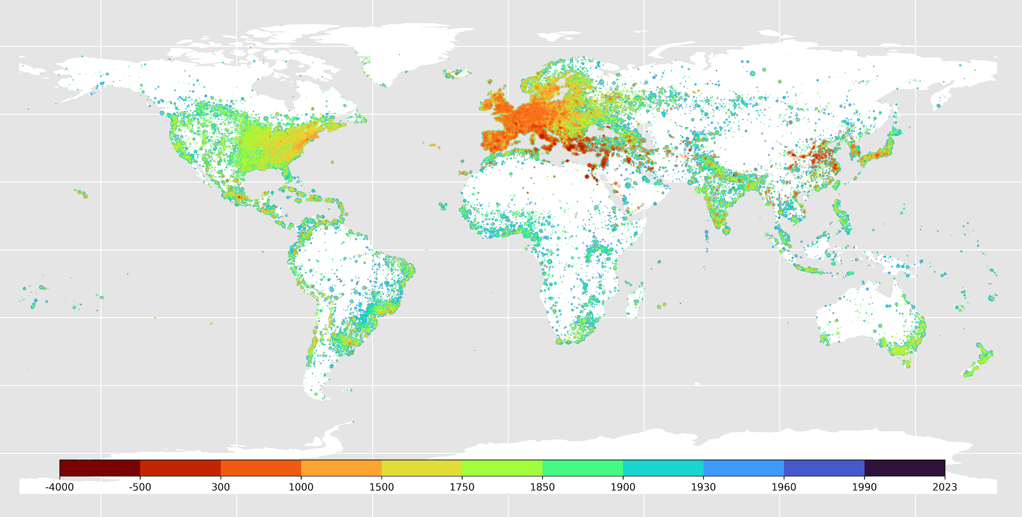
Again, a remarkable result. The sheer density in Europe and the East of North America is quite dazzling compared to other places. One can also clearly see a spread of human civilisation across the globe. Truly strange is the fact that China and India, which have almost always comprised the largest share of the world populationSee for example this Wikipedia article for the year 1500., are almost completely absent.
Equipped with some more gadgets, we repeat our self-made experiment from earlier and calculate the fraction of the world population in the BHoHT dataset over time. Laouenan et al. also calculated a sort of popularity score that they call visibility index, based on the number of sitelinks, readership statistics and such for each individual, so we can now investigate when the most quantitatively interesting people lived as well. We graph the subset of people, ranking below different logarithmically spaced visibility index quantiles:
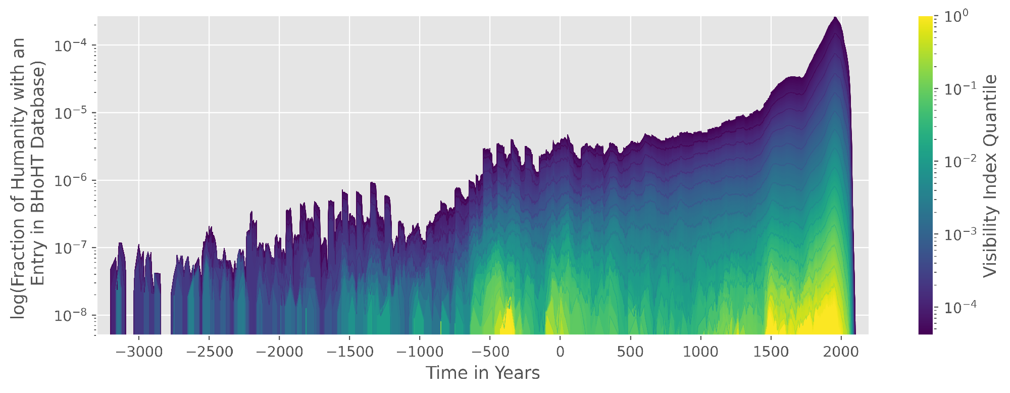
The order of magnitude and the general shape are the same as before, so three cheers to that; it goes to show how close you can get to a paper in a Nature journal with a couple lines of SQL. This is a joke of course, please read the original paper and find out how much cooler it really is! For example, you will notice that the population numbers extend further than the present, because an expected lifespan was forecasted for people who are still alive. Interestingly, the top quantiles of reader's interest are rather concentrated on certain periods, such as around 400 BCE. Our protagonist from earlier, Seneca, might also visible here with the spike at around 0 BE. If we look at it this way, we can also see our fixations or, to be more positive about it, fascinations about the past in a quantitative way. Conversely, blind spots become visible as we saw a moment ago on the map. Perhaps now is a good time as any to talk about the huge disadvantages of using Wikipedia derivatives for this sort of analysis, namely that a huge fraction of readers and editors is Western and English speaking. ... disproportionally male, disproportionally rich and so on. See for example Rainie & Tancer (2007). That said, we have reasonable doubt that things have evened out a little since then. It would be very cool to have some means of quantifying these blind spots and see which kinds of bygone people, with records about them still existing in some other form, have not made it into our datasets here.
Dear Readers
We now make the decision to interpret this somewhat critical bug as a feature and take a closer look at the readers and editors. Take language bias for instance, which can also be shed light upon with BHoHT: In the form of a heatmap matrix, we graph the number of articles about people from a given country, written in given language. Since there is such a big difference in the number of articles between different languages, we always divide by the total number of articles in each language, which lets us compare how much a certain language favours specific countries of origin. In other words, the matrix is normalised by row. The color scale is applied linearly.
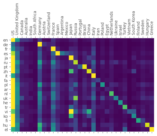
Yet another intriguing result. Almost all languages have a strong home bias to the countries they are spoken in. In general, most articles about US Americans, but some languages show an especially strong love to their own people, for example Spanish placing Spain at number one and Argentina on the third place. Editors speaking Vietnamese seem to feel a strong affinity for Japan, howeverAnd who could blame them?, exemplifying a general phenomenon that geographic proximity between language and country seems to help a little. One would think that, certainly with the help of machine translations, the internet would have weakened instead of enforced regional concentration of information in this way. Yet, the more mature editions of Wikipedia like the extremely population German one seem to exhibit more, not less of it. Again there would be much to comment on, but we make haste and get to the last point.
Namely, we would like to go back to our original temporal way of thinking and at the same time stay on the topic of readers interest. Grouped by gender for reasons we talk about shortly, we are now interested in the amount of times the Wikipedia articles have been read, once per article and once per capita of the world population, also made possible by the BHoHT data. More precisely, we are talking about the aggregated hits on the Wikipedia pages between 2015 an 2018.
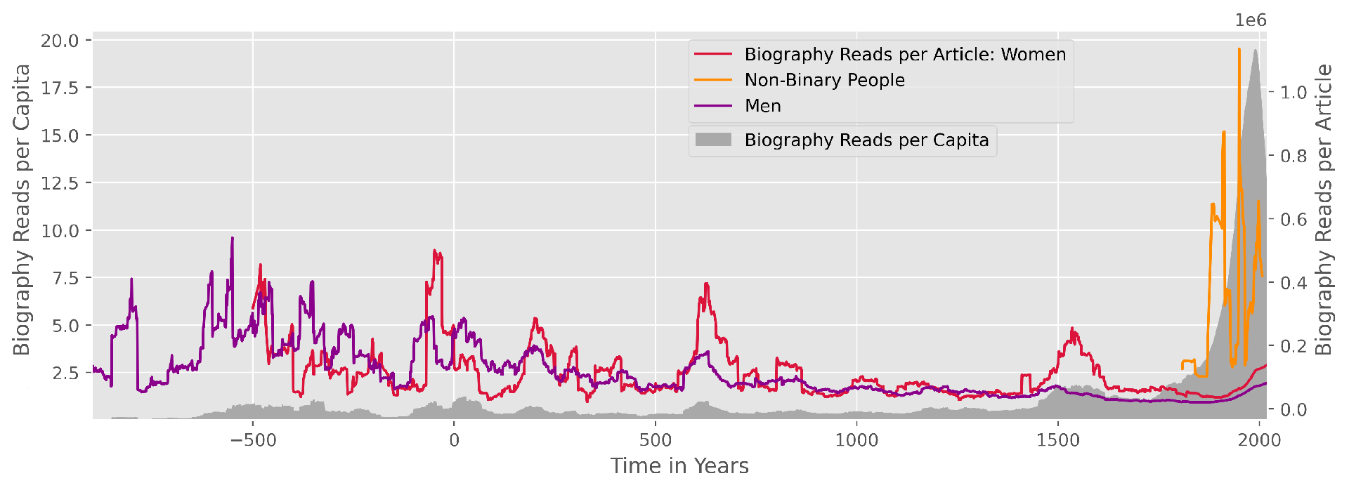
Again, we can see how unevenly distributed the interest per article (in colour) really is. Also clearly visible is the highly non-monotonous but still somewhat exponential nature of the biography reads per capita (in grey), reminding us of the population curve. At the same time, we can see how volatile the division by the number of articles really makes this because of the low number especially when grouped by gender. An entertaining detail is that Jean of Arc has single-handedly made a big dent in the curve for women during her short life from 1412 to 1431. We seem to find a general phenomenon that readers prefer rare and underrepresented groups of people, perhaps because their members had to do something particularly noteworthy to get passed on in this way.
It is time to leave a very interesting dataset alone despite the opportunity for a lot more analysis. If want to point out any mistakes or share ideas about where to take this, you can write to info@fi-le.net.